Time, made visible.
Context
Hourglass is an AI assistant for work. It plans your day and takes care of the small tasks, so more of the day goes to real work.
It came to us with a name and a product, and no brand. Most AI tools look alike. Hourglass needed to look like something else. That was the problem we got.
The thinking
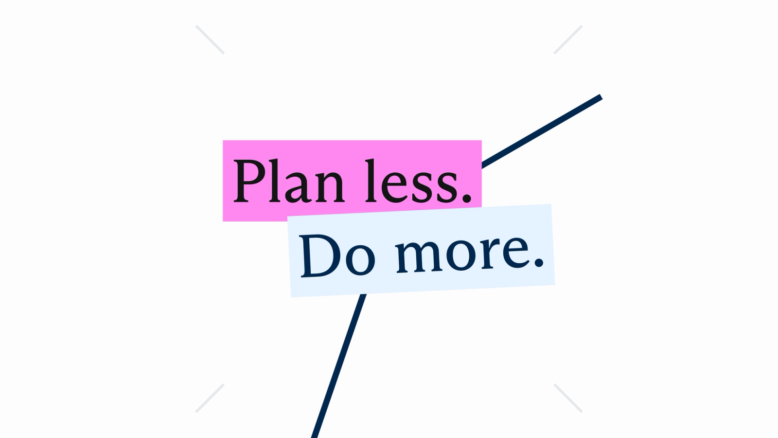
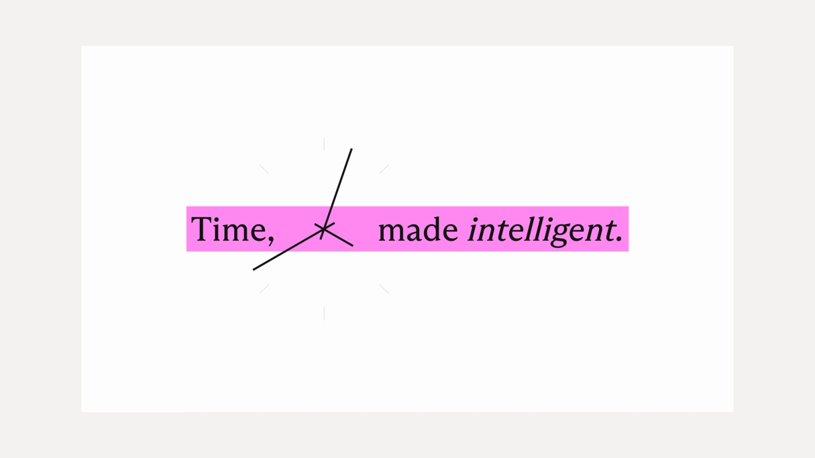
The product saves time, so the brand is built around time. The main device is a clock. Two thin hands cross the type, and the words sit on blocks set slightly off angle, like notes on a desk.
Everything is set in one serif, with italics for emphasis. The mark is the H from the wordmark.
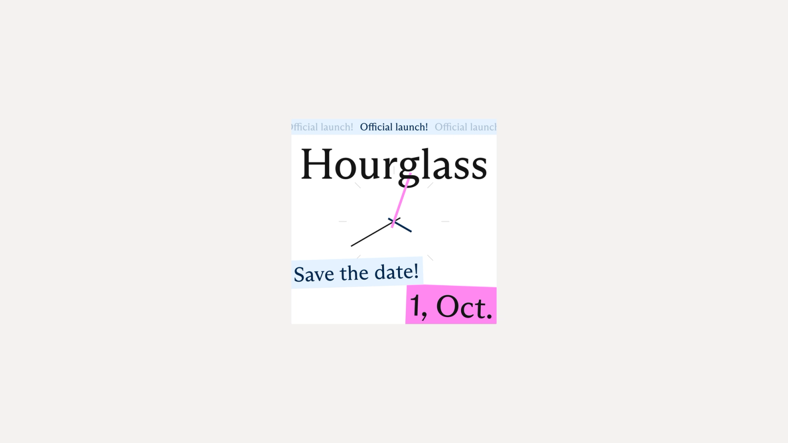
The launch posts use the same system, so Hourglass looked consistent from the first announcement.
Website
The website has one job, which is getting the download. The hero states the promise in one line and has one button.
The nav sits in a small pill with Features, Pricing, FAQ and About. The demo sits right under the hero, in a folder with a tab, so a visitor sees the product before they scroll.