Growth as a system.
Context
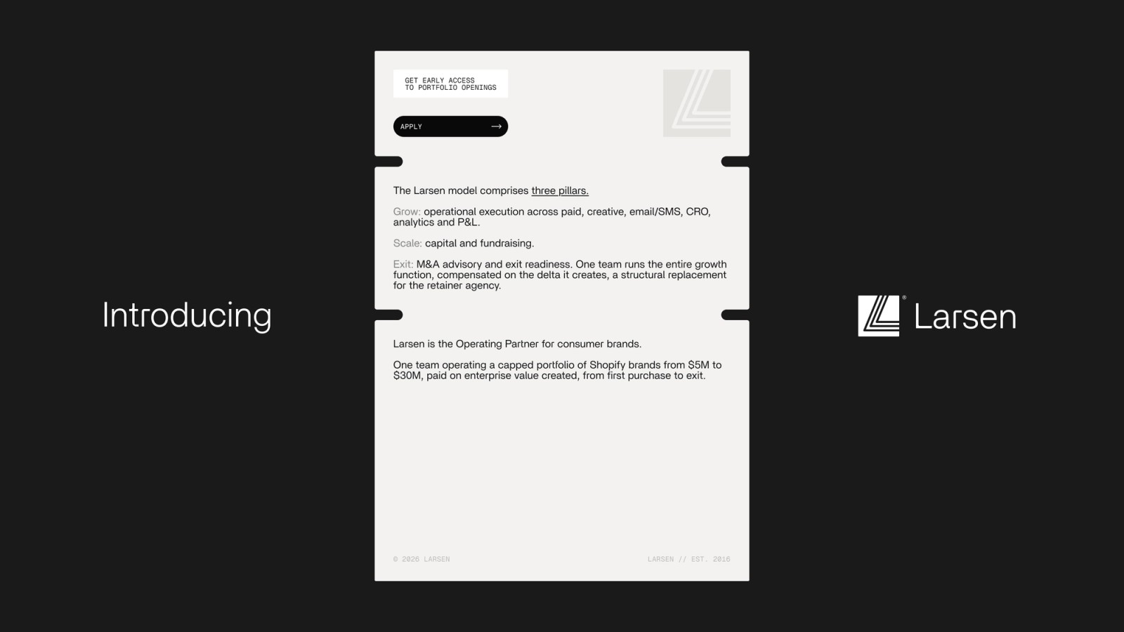
Larsen is an operating partner. They run growth for consumer brands doing $5M to $30M a year and get paid on the number they move. The model was strong. The brand still looked like the agencies they replace. That was the problem we got.
The thinking
Larsen's whole pitch is a comparison they refuse to make. The word agency never shows up on the site. So the brand had to make a founder feel the difference without us ever pointing at it. And it had to survive being forwarded to a board.
The first move was the name. Larsen Digital became Larsen.
One idea carries everything: every lever connects to enterprise value. So we drew Larsen's operating system as a graph, where every line ends in a double ring marked enterprise value. Colour is ink, bone, stone and white. Shape and line weight carry the hierarchy. Colour stays flat. Britti Sans for headlines, Geist for body, Geist Mono for the data layer, so the site feels like a platform a board would trust.
The result is a brand that does the filtering for them. The wrong founder feels intimidated and the right one feels seen.
Website
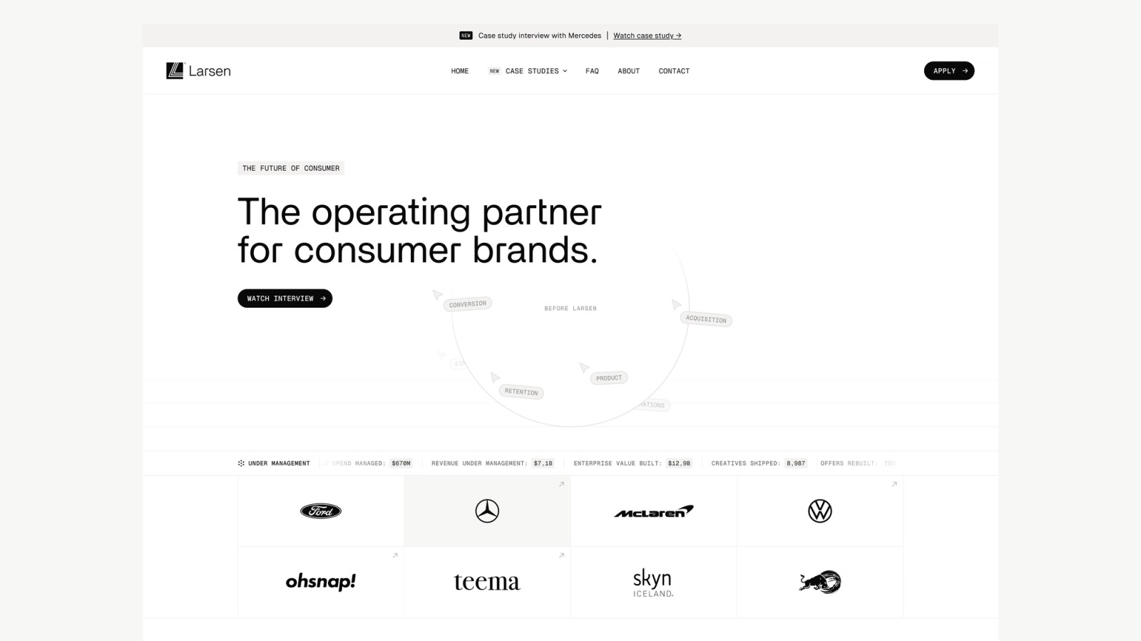
The homepage runs in the order a founder needs to be convinced. Hero, proof, the Mercedes interview, logos, what an operating partner is, the cost of running four vendors, then the constraint framework. That last section is scroll driven: five domains fill an enterprise value bar as each constraint gets solved, and services only show up as the tool that constraint calls for.
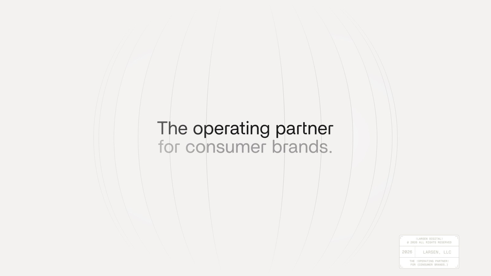
The hero is very minimal on purpose, there is no subheading and no Apply button. Larsen only takes a handful of brands a year, so the page qualifies before it asks.